

The Doherty institute recently released a report that led to an agreement between state and federal leaders about a roadmap to transition out of lockdown-management of covid19. Models looked at a variety of scenarios by simulating outbreaks with 30 infected individuals. The current outbreak in Sydney has prompted many state leaders to back away from this roadmap, pointing out that since the numbers are unlikely to get back down to match the simulated initial conditions the models must be revisited. The Prime Minister hit back, stating:
“The starting point does not influence the overall conclusions of the model.” - Scott Morrison, Prime Minister
The director of the Doherty Institute Sharon Lewin reinforced these statements on ABC’s The Drum, claiming:
- “There really is no difference with how the model predicted outcomes… whether you start at 30 cases or 800 cases.”
- “The trajectory is thought, and modelled, and predicted to be the same as what was in the original report.”
- “If you start with 100s of cases you’re just catching the same curve… you’re getting to the peak quicker.”
- “Whether you start at 30 cases or 800 cases, you can still open up safely.”
- “The model which was published and is widely available is applicable to whether you start with 30 cases or 800… the model still holds whether you start on low numbers or high numbers.”
Having recently looked into the Doherty modelling, these statements surprised me. I decided to investigate further.
TL;DR
- Basic modelling shows total case numbers should be roughly proportional to the initial infections assuming optimal contact tracing assumptions and continued vaccinations.
- Figures from the Doherty report indicate opening at 800 initial cases with 70% vaccination would be worse than opening at 50% vaccination and 30 cases.
- Optimal contact tracing would be significantly more difficult with more initial cases, leading to a regime change resulting in orders of magnitude more cases.
- Results in the Doherty report indicate that consequences of relaxing restrictions at 70% vaccination depend on the initial number of cases:
- 30: peak daily cases around 200, negligible ICU admissions, 0 or 1 deaths per day.
- 800: peak daily cases around 100,000, ICU capacity breached, peak deaths over 100 per day.
Disclaimer
I’ll be the first to admit I’m no epidemiologist, and if that doesn’t immediately conjure up thoughts like the header image then frankly, I’m disappointed in you. I do have an honours degree in applied mathematics with a heavy focus on mathematical modelling which did cover basic epedimiology, I have a PhD in computer science and I am a full time researcher at a major Australian university. While epidemiology has never been a major focus of mine, my background is not irrelevant. Where exactly I lie on the spectrum from “random guy on the internet” to “leading authority” I’ll leave for readers to judge. I have written this to satisfy my own curiosities and communicate my thoughts - I’m not paid by anyone to do this, and I don’t represent any other body.
I should also point out that the actual models used in the Doherty report have not been made publicly available. A description of the models has been provided, as has a discussion of the results, but it’s very difficult to make irrefutable claims without access to the underlying simulations. Maybe there’s a factor in the model not described in the paper - in which case, if it has a significant influence on the results it should be discussed publicly. Maybe there’s a major factor in the report I’m not considering which means I’m completely wrong. I’d consider my further education in this regard to be a best case scenario.
This post is targetted at people with minimal technical background. Details are intentionally kept sparse and discussions are limited to high-level concepts to aid accessibility (model code is available here if you’re interested), but if a graph is going to scare you this isn’t the post for you.
Modelling the Brink
To begin, I think it’s important to discuss the situation in Australia. We are incredibly fortunate to have had very little covid thus far in the pandemic. Sporadic outbreaks have been handled with extensive lockdown measures. As vaccination rates ramp up, expensive lockdowns can be replaced with less costly measures. The balance is critical: excessively restrictive measures could cost hundreds of millions of dollars, while insufficient measures could result in uncontrollable spread, large numbers of death and the possible collapse of a health system.
Our goal is to find the Goldilock’s set of restriction where just enough is done to curb outbreaks and no more - to teeter on the brink of calamity without inadvertently plunging over the edge. To make things harder, the Goldilock’s zone is constantly shifting as our vaccination rate goes up. Short periods of exponential growth are tolerable, but longer periods leading to high case counts will make cost-efficient measures like track-and-trace unviable. All models are wrong and given the difficulty of the problem the Doherty models will be no exception - but that doesn’t mean they are without value.
Initial Infections
Let’s begin by investigating some very simple models to understand basic pandemic phenomena. To be clear, these models are for illustrative purposes only - they are not meant to model Australia’s covid outbreak. Once we have an understanding of these phenomena we’ll be in a better place to understand the results in the Doherty report.
SIR models (susceptible, infected, recovered) are perhaps the simplest disease models for contagion spread (or zombie outbreaks), and allow for susceptible people to become infected before recovering and becoming immune. A couple of simulations are provided below with differing initial case counts.
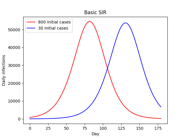
In both cases we see exponential growth transitioning into a plateau before eventual exponential decline as the population gradually becomes immune via infection. Higher initial case numbers result in an earlier peak, but the overall trajectory is much the same. It might take a couple of months, but the 30-case outbreak eventually grows into an 800-case outbreak, at which point the remainder of the simulation is almost identical. Critically, both the overall and peak number of infections remains almost exactly the same.
What happens if we add vaccinations to the mix? This gives every susceptible individual an additional path to immunity. If we assume a relatively high, constant daily rate of vaccinations and some creative data visualization we get the following:
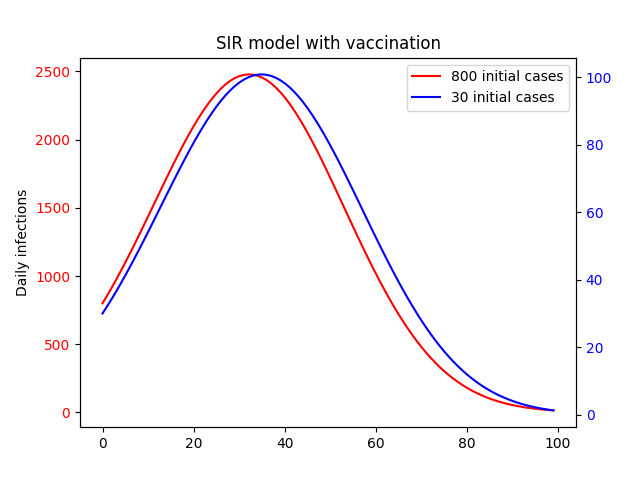
Like in the base SIR model we still see growth followed by a plateau and eventual dropoff, and higher initial cases result in an earlier peak. You would be forgiven for thinking then that the initial number of cases is no more relevant thn the no-vaccination case. However, there is one key difference: scale. In the above plot, we have plotted each curve on it’s own y-axis. The difference becomes clear when we put them on the same axis.
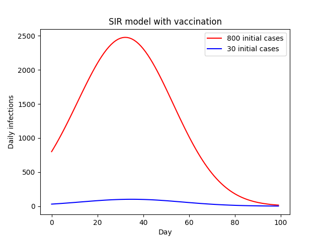
This results in a 25-fold increase in the number of cases as a result of the 26-fold increase in initial cases.
So what’s going on here? Well, we’ve already established that in the no-vaccination case a smaller number of initial infections is equivalent to a lag in time. With daily vaccinations, that lag gives us time to significantly increase the overall vaccination rate.
This linear relationship is exactly what we would expect in an environment where daily vaccinations greatly outnumber infections. To make this even more clear, we can plot the total number of infections compared to the initial outbreak size.
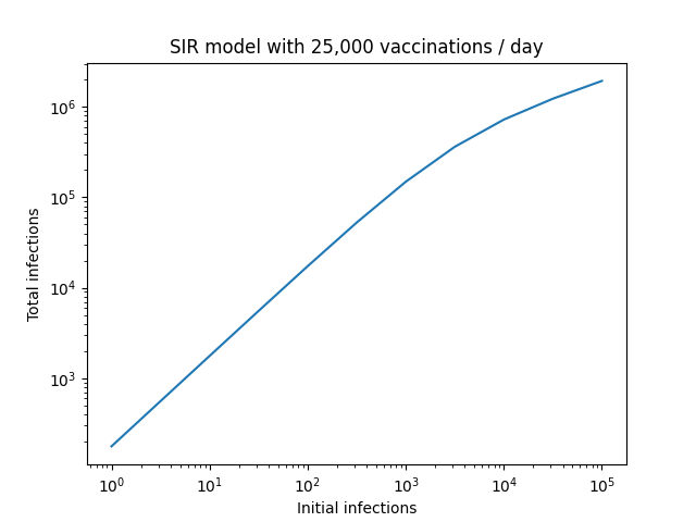
The proportionality breaks down at very large initial case counts, but this is also to be expected. In this regime, the number of vaccinations no longer greatly outnumbers infections. If we extended things further to the point where new vaccinations are small compared to infections, we would see this plateau towards a constant value as our model converges to the base SIR version, where the number of initial infections has no impact on the final number.
The Doherty models are considerably more complex than this. However, I see no reason that the underlying dynamics should be any different. The report doesn’t analyse simulations with initial case numbers other than 30, but that doesn’t mean we can’t infer what they’d be. For example, below is the plot of infection numbers assuming an initial outbreak of 30 infections at 50% vaccination rate, along with the 70% baseline.
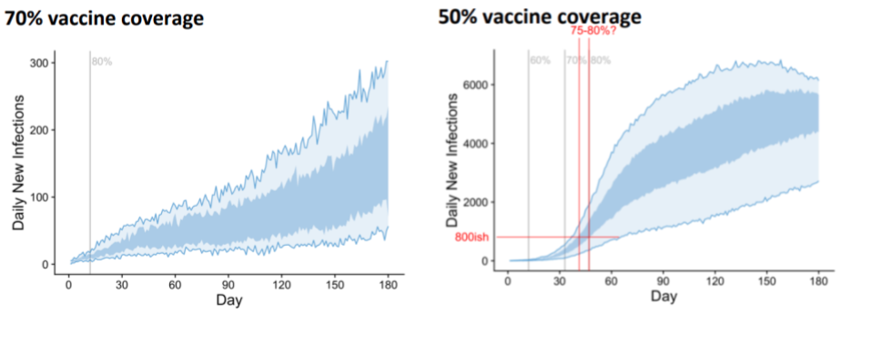
My edits in red attempt to illustrate that we would expect to see similar numbers of cases if we started with 800 cases and an initial vaccination rate of 75-80% and result in an order of magnitude more cases than the baseline (you could use the wider confidence interval associated with the light blue area and get 72% to something-bigger-than-80% if you’d prefer - the conclusions are the same). Presumably opening with the lower vaccination rate of 70% with 800 cases would lead to more infections still.
In layman’s terms, if we opened up at 50% vaccination with 30 cases, we could increase vaccination rates to 75-80% in the time it takes for cases to grow from 30 to 800. This would result in fewer cases than opening at 70% vaccination with 800 cases.
Trace, Test, Isolate and Quarantine (TTIQ)
A large amount of the modelling relates to the effectiveness of TTIQ measures, and Lewin is transparent about the uncertainty, stating, “What is less certain is how the test, trace and isolate system can keep up when you have hundreds of cases compared to 10s of cases”. Before we get into the details of how higher initial case numbers might affect TTIQ effectiveness, it’s worth summarising what the report says about the impact of optimal vs partial TTIQ effectiveness.
Firstly, in order to hold infection counts stable at 70% vaccination rate, the model predicts high-level restrictions would be needed 22% of the time with partial TTIQ, whereas these high level restrictions would be rarely required if at all with optimal TTIQ. They also run simulations without any non-pharmacological public health interventions starting from 70% vaccination.
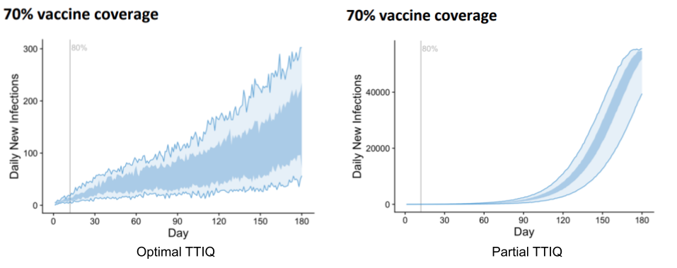
The difference is drastic. Optimal TTIQ results in highest daily cases over the period in the low hundreds, while partial TTIQ gives rise to 40,000. To be clear, this roughly 200-fold increase is due solely to the effectiveness of TTIQ.
Having established the importance of TTIQ effectiveness, let’s now look at how initial case numbers might affect things. It’s not hard to imagine that a contact tracing system might perform poorly with a large number of cases, and that the greater the number of cases the worse the performance. This is not how it is modelled in the Doherty report - rather, they consider only two regimes: “optimal” and “partial”, with the following description:
- ‘Optimal’ TTIQ response, deemed achievable when active case numbers can be contained in the order of 10s or 100s; and
- ‘Partial’ TTIQ response, deemed more likely when established community transmission leads to rapid escalation of caseloads in the 1,000s or beyond.
In order to relate this definition to Lewin’s statements, the question becomes: is 800 closer to “10s or 100s” or “1000s or beyond”? While most people would say 800 is in “10s or 100s”, there’s a strong mathematical argument that it’s closer to “1,000s or beyond” (800 is 8x larger than 100, but only 1.25x smaller than 1,000). Having said that, whether or not 800 counts as being in the 100s or 1,000s isn’t really the point - the real question is whether our TTIQ systems can perform optimally with these numbers.
To answer this, let’s consider the outbreaks currently affecting our two largest cities:
- Melbourne successfully handled an earlier incursion, getting on top of an outbreak and bringing numbers back to zero with a peak number of daily cases in the 20s. This recent outbreak has daily cases staying stubbornly around 50 despite harsher restrictions.
- Sydney’s outbreak is almost at 1000 cases a day, and while numbers aren’t escalating quickly, the heavy lockdown measures currently in place have yet to result in a peak. The contact tracing team is receiving assistance from WA, and test results are no longer consistently being returned within 24 hours.
This indicates to me that Melbourne is pushing the limits of optimality for it’s contact tracing, while NSW has long since exceeded it. It seems implausible to me that an outbreak starting at 800 and modelled to grow by at least an order of magnitude would not exceed optimal TTIQ capacity.
Putting it all Together
Let’s put this all together and see what the Doherty report might say about relaxing restrictions at 70% with 800 daily infections. As discussed previously, according to the discussion in the report, trajectories should be worse than those presented for opening at 50% vaccination and 30 daily infections. Regarding TTIQ, the Doherty report gives us one final gem to support the hypothesis that optimal TTIQ is unlikely:
“… rapid epidemic growth is expected at 50 and 60% coverage… In these scenarios reduced effectiveness of the public health ‘test, trace, isolate, quarantine’ (TTIQ) response is anticipated due to high caseloads.” - Doherty Report, Executive Summary
So an outbreak seeded at 70% vaccination with 800 cases is worse than an outbreak seeded at 50% vaccination with 30 cases, and such an outbreak will not have optimal TTIQ effectiveness. To understand the effect of the initial outbreak size, let’s compare the 70% optimal TTIQ trajectory to that starting at 50% vaccination with partial TTIQ. All the following are from the Doherty report using the transmission reducing strategy.
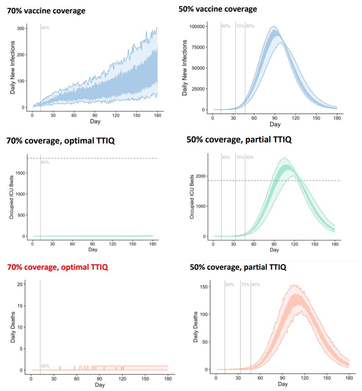
To summarise, opening with 70% vaccination at 800 cases rather than 30 cases would lead to:
- a roughly 500-fold increase in peak daily cases;
- ICU capacity being exceeded; and
- hundreds of deaths per day.
Now an argument could be made that the TTIQ system may operate optimally initially before breaking down as case numbers increase. A more sophisticated TTIQ model that allowed for changing effectiveness over time might yield less extreme results, but improving on the Doherty model is beyond the scope of this discussion. The point is: the 25-fold increase in daily case numbers due to increased initial outbreak size will compound with the 200-fold increase in reduced TTIQ effectiveness due to higher daily rates, and this massive increase in daily cases will have knock-on effects to ICU admissions and ultimately deaths. The compounding is not perfect - we only see a 500-fold increase in case numbers, rather than 25 x 200 = 5,000, but this is to be expected as the assumption that the number of cases is significantly lower than the number of daily vaccinations breaks down.
Conclusions
Low initial case numbers give us additional time to vaccinate more individuals. Basic modelling shows daily infections rates should be roughly proportional to size of the initial outbreak. Larger initial outbreaks lead to larger daily case counts which cascade into reduced contact-tracing effectiveness and a further increase in case rates. While the difference between 30 daily infections and 800 might not seem large, in the context of relaxing restrictions at 70% the consequences could hardly be starker. I see no way of reconciling these observations with the statements of Lewin or the Prime Minister.